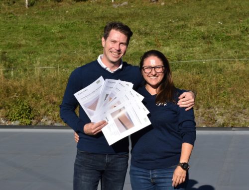
Many people choose to buy cladding with primer and the first coat of paint. You will save time, and the building is protected as soon as the cladding is set up. But which color should you choose?
Mountain scenery
Here it`s the brown, grey, black and red colors that dominate. Consider the Norwegian tradition of color used in the mountain landscape. Transparent stain that emphasizes wood structure is very well-suited. Walls get structure and life. The painted color may be contrasts in white, light, grey, or muted green, yellow or red.
Forest
The colors of nature are darker than you think. Dark colors with blackness look great. Then the building slides well into the environment of trees and vegetation. Earth colors also have a lot of nature in them and are therefore well suited. The autumn palette with red, orange, yellow and green are popular colors.
Open landscape
White and bright colors are great in open landscapes. White and light houses look best with some space around them. Quite white houses in dense vegetation can easily stand out as the contrast becomes too strong. Then it may be better choosing a slightly softer white such as egg white, frosty smoke or similarly colored white.
Urban areas
Pay attention to the surroundings and the color of the neighboring houses. They should play in teams and have a common character. Choose combinations of related colors, preferably colors where the contrasts are not too large.
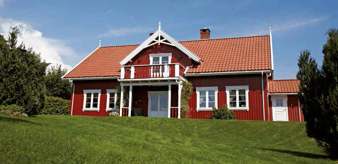
Spot color creates a great harmony
By using related colors throughout the house, the house gets a calmer look. Don’t use too many colors for different details. Feel free to have the porch and eaves in the same color as the wall – it helps to create harmony. Remember to order the materials for the porch, eaves, corner boxes and flooring while ordering painted coverings. You choose the color yourself!
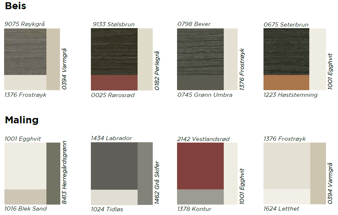
Color palettes
When you choose from some of Jotun’s colors you can be sure that the color is good quality and adapted for outdoor use – and you can add a beautiful, harmonious and personal touch to your house. Here you can see some color suggestions with spot colors.
The color palettes are indicative. For a more accurate color experience, we recommend you to look in the Jotun’s Color Map or the swatches in our own showroom in Rogne.
Still in doubt about which color to choose? Read more about color inspiration and get specific tips and advice on jotun.no, or on Jotun’s LADY blog.

